

ScarlettMac Events — Winefolk Festival • Case study
One identity. A whole festival campaign.
For ScarlettMac Events, Grendesign brought Winefolk Festival to life through a distinctive identity and a coordinated set of print and digital marketing materials. The work connected the festival poster, artist announcements, reusable social templates and event listing through the same bold visual language.
The brief: give a new festival its own personality.
Winefolk was a new festival presented by Red Hill Estate at The Briars on the Mornington Peninsula. Its mix of Australian music, wine, beer, cider and food called for an identity with energy and character, ready to introduce the event before its first audience arrived.
ScarlettMac Events needed that identity to work wherever people encountered the festival: a poster, a social post, an event listing or a promotional piece. The brief therefore went beyond a standalone logo. It needed a visual direction that could hold together a varied campaign.
A bold wordmark, coastal colour and a crowd of faces.
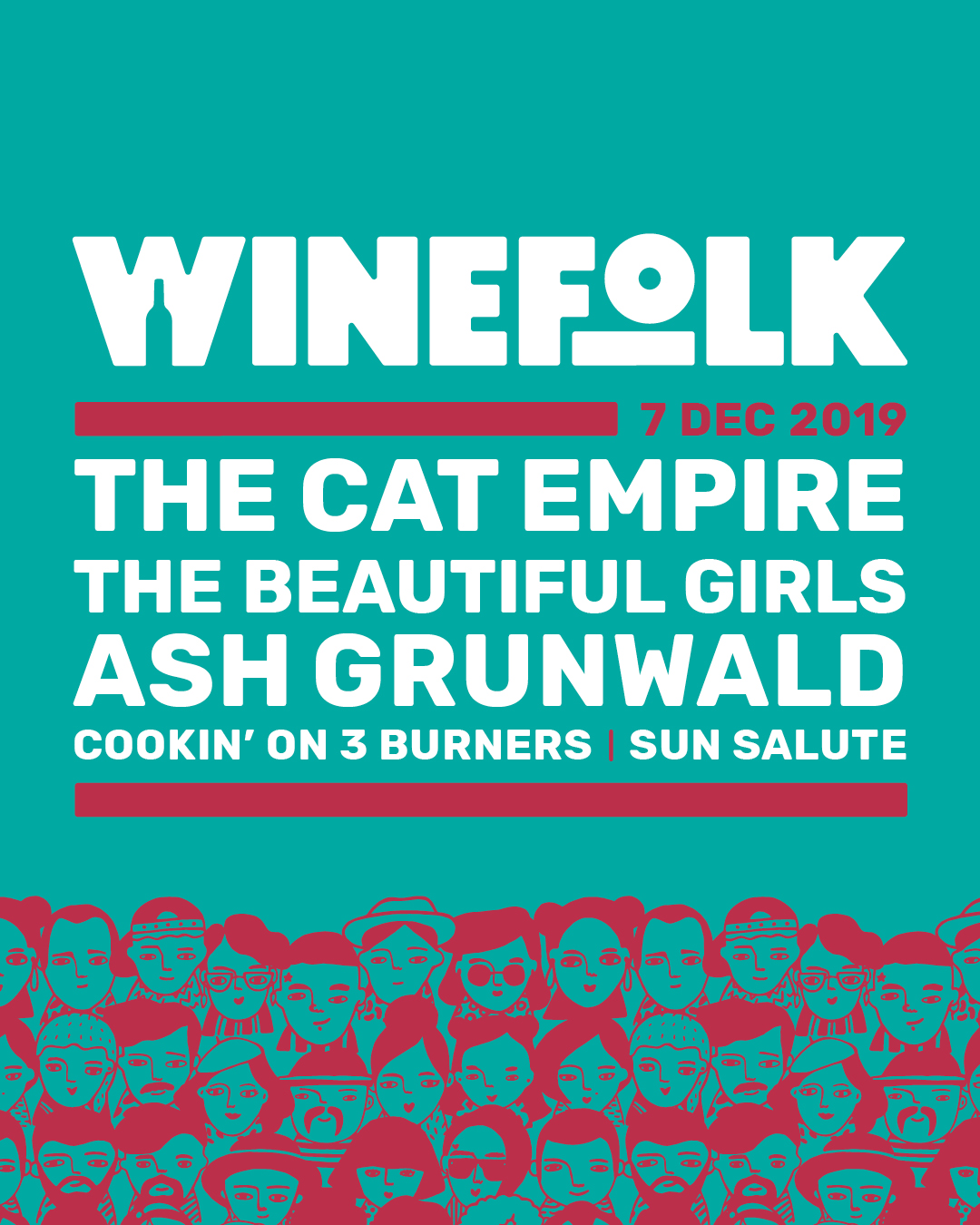
The creative direction paired a bold, contemporary wordmark with a colour palette drawing on Red Hill Estate’s red and gold, alongside a bright coastal teal. The combination gave the festival a playful character suited to its music, drinks and summer setting.
A supporting illustration of different faces became a distinctive part of the visual system. We brought that pattern into the campaign to give the “wine folk” a visible identity, adding personality while allowing the main event information to remain clear.
Build the campaign around the message of each format.
The festival poster gave the artist line-up a clear hierarchy, supported by the date, event details and presenter marks. The illustrated pattern carried the identity without overwhelming the practical information people needed to understand the event.
Social media artwork included event announcements and line-up designs, together with branded layouts that could be customised for quotes and further event information. An Eventbrite header extended the same identity into a wide event-listing format. The formats changed; the visual connection remained.
Carry the identity into print and promotional materials.
The campaign included a print advertisement and promotional postcard as well as the festival poster. Each uses the established logo, colour and graphic system, adapting the composition to the available space and the information that format needs to carry.
A lanyard application shows how the landscape identity works in a further promotional format. This gave the event team a clear view of how the brand could extend into further promotional materials while retaining its character.
A connected creative toolkit for the event team.
The project brought brand identity, social creative, print promotion and event-listing artwork into one coordinated suite. It supplied both finished campaign pieces and reusable social layouts, supporting consistency as the team changed the message or introduced more event information.
For a festival, that consistency matters across many small encounters. Someone can see an artist announcement, open an event listing and later encounter a poster, with a clear visual link between them. Lisa MacGregor’s feedback captures the impression the identity made before the event took place.
What we delivered
- Festival brand identity and logo
- Supporting face illustration/pattern brought into the brand system
- Poster and festival signage design
- Event announcement and artist line-up social artwork
- Reusable social media templates
- Eventbrite header artwork
- Print advertisement and promotional postcard artwork
- Lanyard brand application
“We love the Winefolk artwork you have created, the logo is perfect and the poster artwork is really eye catching, we have had lots of comments saying how ‘fun’ our branding is! I’m really proud to share it around, you have made our event really come to life and set the tone before the event has even happened, thanks so much!”
About this project
What marketing materials did Grendesign create for Winefolk?
The work includes the brand identity, poster, social event announcements, artist line-up creative, reusable social templates, Eventbrite header, print advertisement and promotional postcard, with a lanyard application in the project presentation.
How did the identity stay consistent across different campaign formats?
The work used the same wordmark, colour palette and face illustration across print and digital artwork. Layout and information hierarchy changed to suit each format while the core identity stayed recognisable.
Why include reusable social media templates in an event campaign?
Reusable branded layouts give an event team a consistent framework for further messages. Winefolk’s templates were designed to accommodate quotes and event information alongside its finished announcement and line-up artwork.
Bring your next campaign together.
Talk to us about your audience, channels and campaign materials. We can help you plan a consistent design approach across print and digital.
Plan your campaign